“Design is a tool.” — George Beylerian
Introduction
Why HCI design? Where does the HCI design differ from other designs?
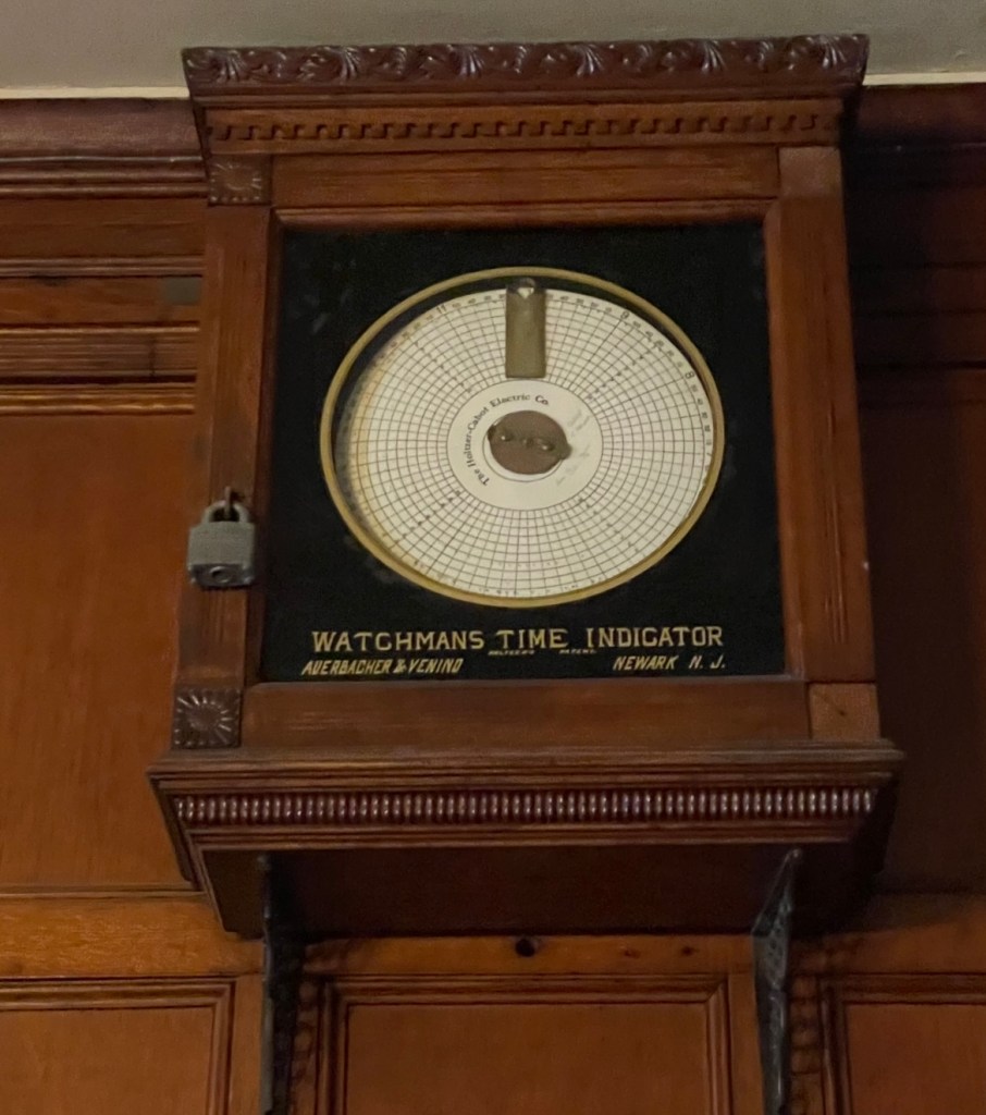
These two leading questions serve as beacons, guiding me as I reconstruct and build my own design processes through practical application. Later, I discovered a partial solution to the first question: once I came across an outdated watchman time indicator for workers, which, while effective for decades, did not align with the current technological advancement trends. With the fast-paced growth of computer science, the need to create powerful human-computer interaction (HCI) designs that fit more flexible and complex needs is pressing. In the meantime, through the proceeds of this course, acquiring more design concepts while testing them in practice, I reconstruct a more specific design process to fit the design in HCI.
Based on the design thinking process we learned in class, which involves empathy, definition, ideation, prototyping, and testing, we implemented four design projects that aim to achieve various objectives while highlighting this process. Navigating through these four projects, I eventually synthesized five points to scaffold the design process in HCI.
- Find what people want instead of what people seem to lack of
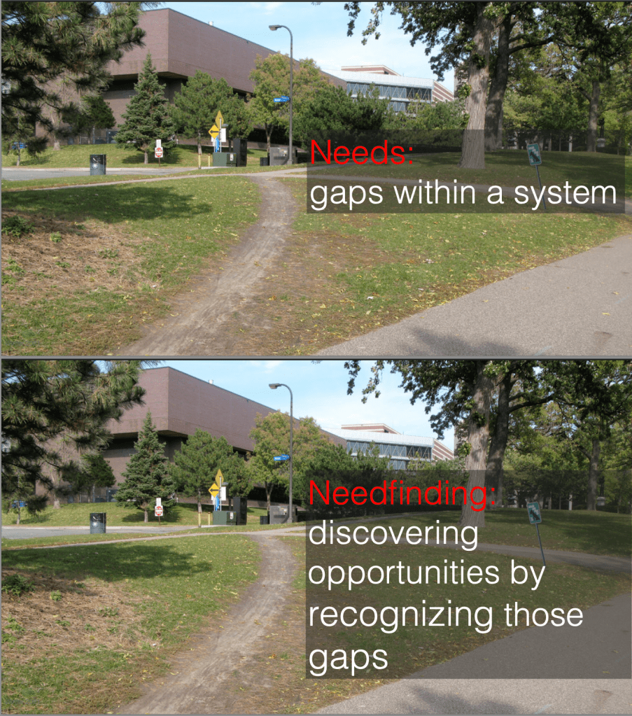
Starting from the premise of design, which is discovering the characteristics of customers and tasks (the process of need-finding), we typically would start from the design stage of “emphasize” to understand potential users. To be specific, in the class, we were given the examples of needs and needfindings (the illustrations are linked below). For instance, the needs are gaps within a system, while the design goal would be to discover the opportunities by recognizing those gaps.
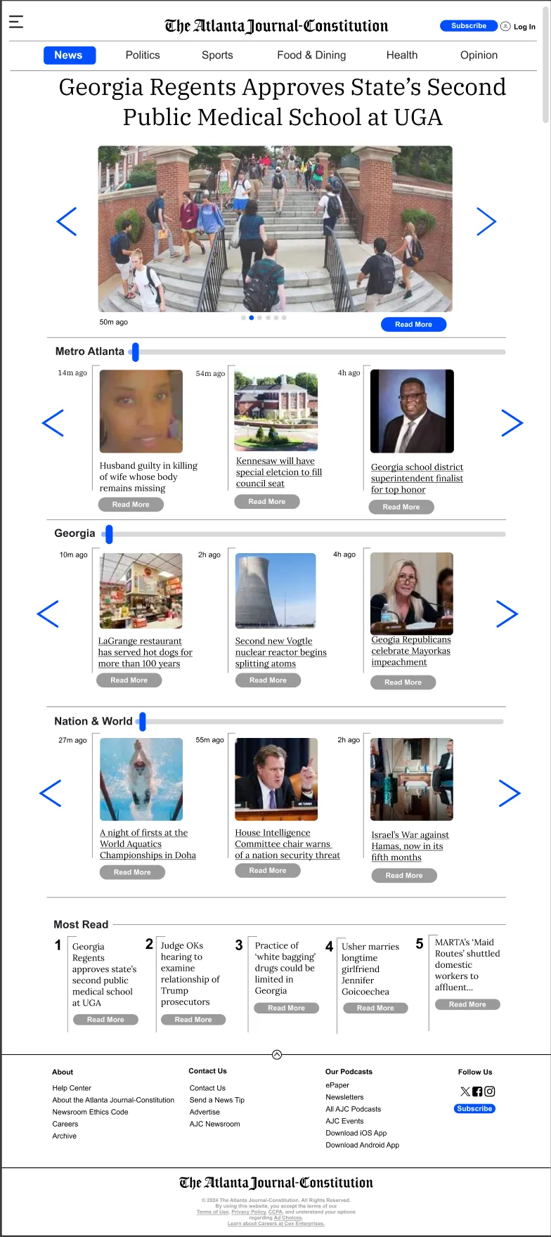
Using techniques such as active observation and interview skills in the stage of emphasis, we finished Project 1: Design for Dimensions. In this project, we aim to employ an existing website and redesign it to have different dimensions for a laptop, a smart watch, and a large display. We first employ active observation skills, trying to immerse ourselves in everyday settings and employing interviews and observations to know the potential needs of people. This process enabled us to identify the design goal with ease: we discovered that people typically have a habit of acquiring daily news, a task that could be challenging for elderly individuals due to the predominantly digital nature of news and the high prevalence of visual impairments. Therefore, we chose to re-constrcut the Atlanta Journal-Constitution Website for elderly people. If we did not walk through this design stage, selecting design goals would be difficult because we would not find the “gaps” in real life.
In addition, guided by the idea that “good design is as little design as possible” from the reading material of “Learning to See,1” we decided to retain the basic structure but change the interactive settings, such as creating a large floating menu, adding navigation bars, and enlarging the fonts, to enable the elderly to pinpoint contents and maneuver around in a readily available and flexible way.
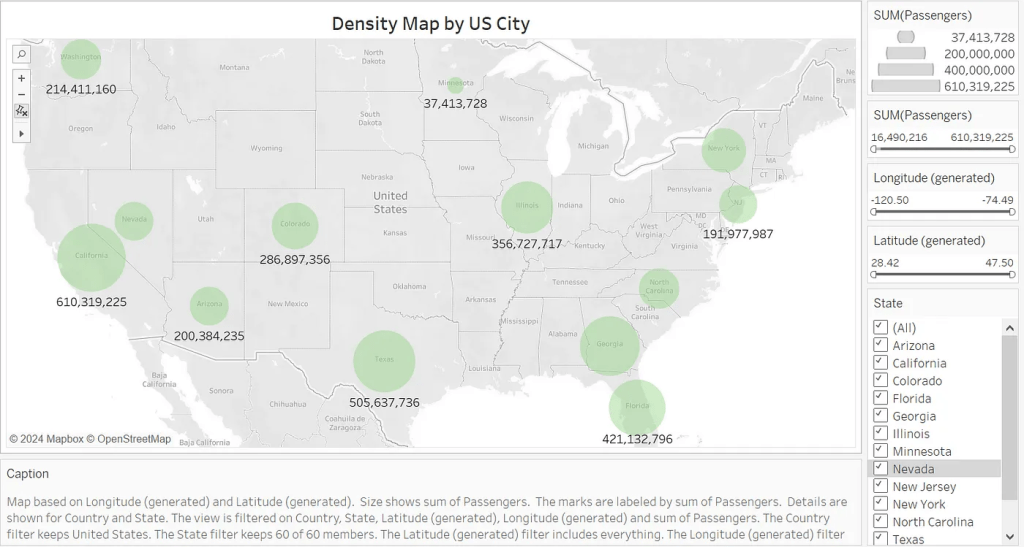
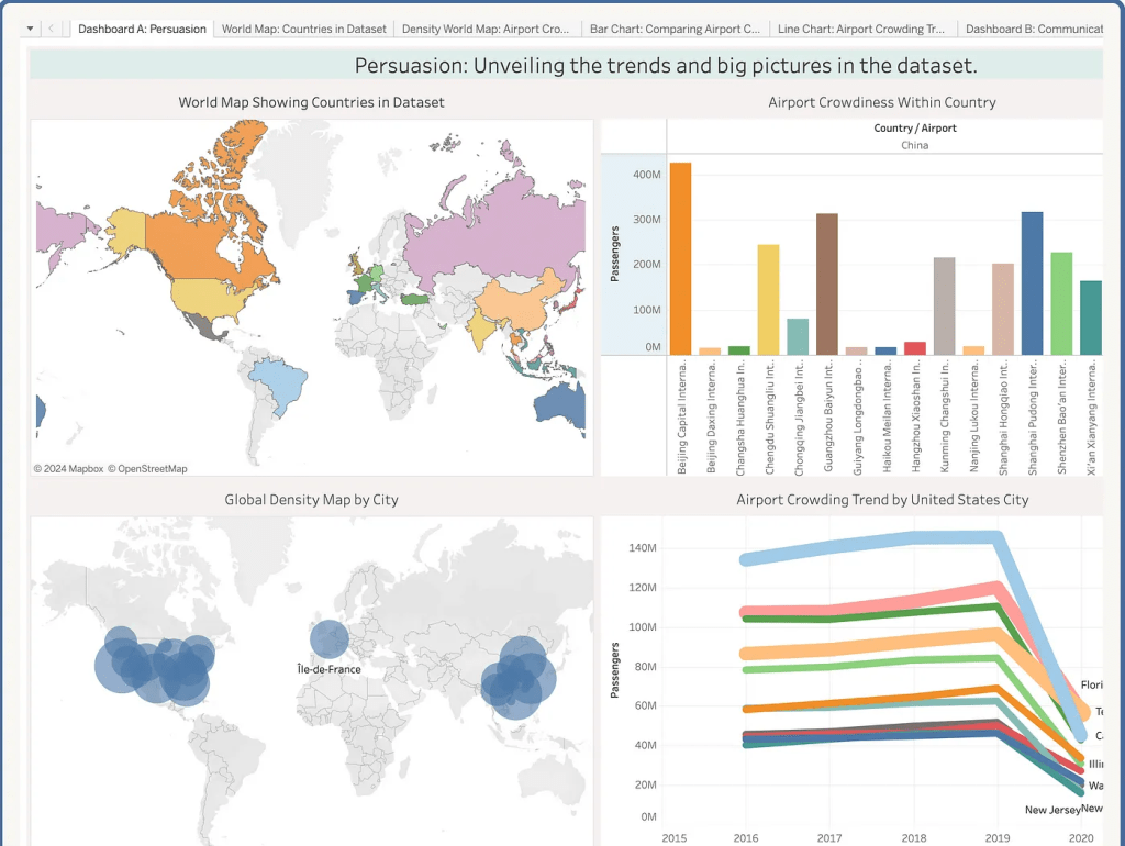
From Project 1, we were inspired a lot by navigating through the empathy stage using need-finding techniques. However, as I progressed to the second project, I discovered the limitations posed by the concept of need-finding. In the second project, our aim would be to select a dataset and employ visualizations to embody it; our selected dataset is the data that embodies the density of airports across the world. As usual, we walked through the emphasize stage, and our initial idea was to employ visualizations to enable passengers who usually take flights and global policy analysts to visualize data from different perspectives. However, we encountered a problem: these groups of people typically do not “need” our data visualization because they can already gain a lot of effective and similar data from media and airports. How can we meet their needs through visualization?
I suddenly realized that in the empathize stage, we should focus not only on what the users lack as needs, but also on what they potentially want. What are the things that users want even though they don’t realize it?
This idea is enlightend by the Invisible Women podcast by Caroline Criado Perez2, which illustrates that sometimes we should pay attention to “invisible” details to better fulfill users’ needs.
With this idea, we delve into our dataset and try to find the unique characteristics in it, potentially fulfilling the users’ invisible needs. We then discovered that our data can provide both temporal and spatial data presentations on the density of airports; with these characteristics, we can use dotplots and other customized visualizations to present users with a span of data across time and region, thus encouraging them to choose their starting point and destination more wisely. To examine my idea, I interviewed several of my friends who are international students with a frequent need to travel internationally; four out of five of them commented that such visualization enabled them to choose destinations easily since they could avoid large-density airports during travel to avoid inconvenience. More importantly, none of them recognized their “need” for this visualization until I presented it to them, as they were accustomed to perusing numerous websites to select a destination each time.
Therefore, the first point that define my design process is we should delve into a more in-depth perspective in the empathize and define stage and figure out what user potentially want instead of what they seem to lack of.
2. Process might be more important than idea
Following the empathize and define stage, we move on to the ideation stage. In Project 3: Design for Another World, we aim to employ VR technology to transport someone to another place. For this project, I employed the strategy of “quality through quantity” from the article “How to Be Creative” by Amy J. Ko3, stressing that first create tons of ideas and select the best ones.

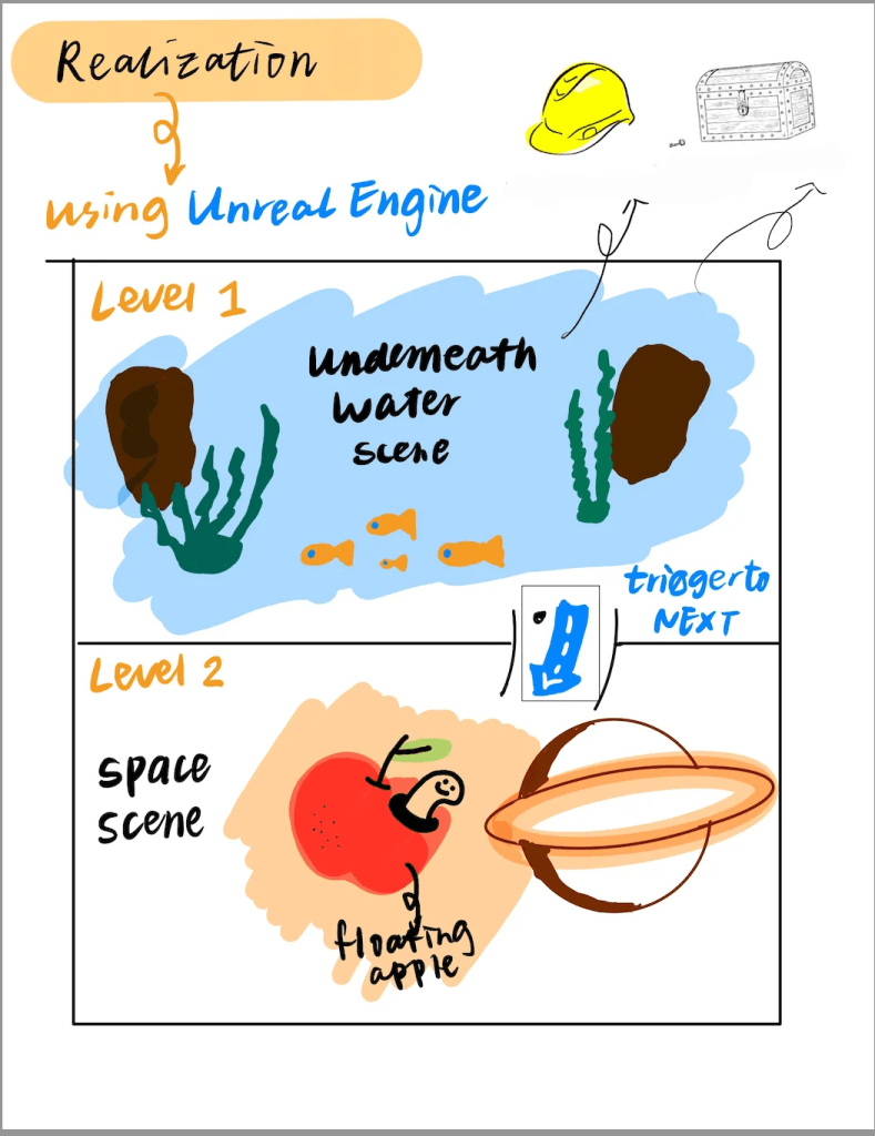
Therefore, I created a lot of ideas; through the ideation process, I think since VR can always create dream-like scenarios, it would be fascinating if we could employ this advantage to provide people who cannot create dreams with an ideal space to experience. In this project, we decided to use VR to transport people with apantasia (who cannot create mental imagery) to a world filled with dreams and fantasy. Inspired by the creating HMW questions in the ideate stage, which is to create questions contains “who, what, when, where, why” to facilitate the process of ideation, we finally decided to employ a two-layer scenarios to actualize our idea.
The first layer scenario would be underwater, while the second scenario would be outer space; both of them would be places that are not readily accessible. In addition, we intended to add a lot of elements, such as a huge hat and fruit, and set tasks such as treasure hunting to facilitate the whisical dream-like experience. Therefore, the places and tasks fit exactly our design goal of creating a safe environment for people with aphantasia to experience dreams and mental imagery.
However, a good idea is not enough. Without a solid and down-to-earth process to specify the idea, the “good idea” would even have a negative impact on the overall design quality.
This is where the expectation not met the reality.
During our prototyping process, when we created the virtual scenes, the biggest problem we met was the layer of outer space design. For the first layer of the underwater scene, since we created a storyline of adding a treasure hunt task and various organisms and objects that might appear underwater in a whimsical way, we found it met the expectation of creating a dream-like scene for people with aphantasia; they have a very flexible space to experience and to create their own memory. However, after finishing the first prototype, I found the second layer could not meet our requirement of providing a space for creating dreams. The space is too basic; there are only several celestial bodies and floating objects; apart from that, the users would have nothing else to interact with. In such a virtual space, it would be extremely hard for users to have a satisfying interactive experience based on the theme of dreams.

I found the main factor that leads to this imbalance between expectation and reality is that we only focused on idea creation instead of idea specification when creating the scene of outer space; we did not establish a very detailed process to fulfill the idea but only contemplated the idea itself. Therefore, even if we tried our best to fulfill the scene with more additional ideas, such as adding floating furniture and other objects that are inconsistent with outer space to create the vibe of dreams, it would be hard to create a mature setting just like the first layer scene.
Therefore, from this experience, I found that the second point that might be significant for the design process is that a pure idea is not enough (no matter whether it is creative or not); the process that enriches the idea weighs way more than the ideas themselves in design.
3. Realization is hard: choose the platform and techniques wisely
After we go through the ideation stage in the design process, we enter the prototype stage. At this stage, I think one of the most important lessons I learned is to always choose the most appropriate platforms and techniques rather than the “best” techniques, especially in the high-fidelity prototyping stage.4
In the project 3, since we decided to employ VR to create a dream-like while immersive experience for the users to faciliate their experience of constructing dreams and interacting with tasks within the dreams. Therefore, we chose the Unreal Engine to fulfill our goal since it is one of the best platforms for create VR games which well known as immersive. In other words, Unreal Engine is the best platform we could choose. However, is it the most appropriate one?
Soon, we found a problem. Although an unreal engine can create the most immersive scene, it is very selective; users can only use one modality when accessing our game. It would be extremely difficult for people who intended to access our virtual scene across different modalities, it would be extremely hard for them to do so. During the testing stage, I found the problem; however, it was too late to change the virtual scene into multimodal scenes since there are a lot of features only available in the Unreal Engine Platform.
This is not a solitary problem; we encountered a similar problem in Project 2 as well. During the process of creating visualizations, we employed Tableau to build assorted graphs. Then, we chose to employ Webflow to create our website. To merge them together, we embedded the Tableau graphs inside the Webflow website. However, users would have different experiences when they access our webpage: for people who use Chrome, sometimes clashes would occur due to the problem of incompatibility compared to users from FireFox.
Learning from these experiences, I realize that during the design process, sometimes the “best” is not a fixed but flexible term. Choosing the most appropriate platforms and technologies would create a more powerful design in the prototyping stage.
4. Efficacy first, beauty next
In the prototyping stage, we would always encounter a situation where we needed to find the balance between effectiveness and beauty of design. Through the design processes of the 4 projects, my perspective would be “efficacy first, beauty next” since the overall effectiveness of the design can truly determine if the design can benefit the users or not; if we truly want to make user-centered design, then making the prototypes satisfy the users’ needs would be prioritized.
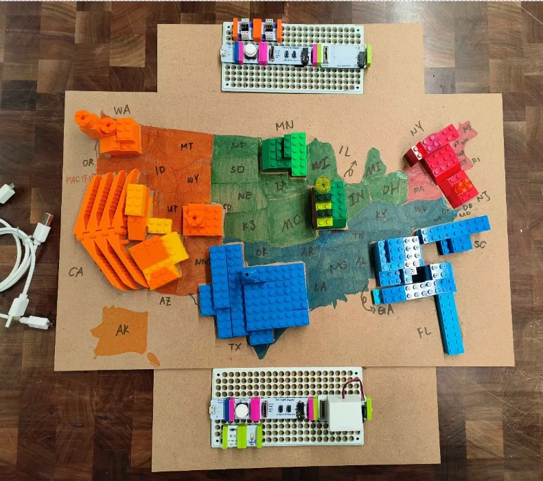
In the design process for Project 4, one of the prototypes we decided to make is a three-dimensional prototype to help people “visualize” the density of airports across the United States using either visual, auditory, or kinesthetic feedback driven by the idea of universal design5. During the design process, we chose to employ Lego bricks to fulfill both the visual and kinesthetic parts. Specifically, we divide the United States into four regions, assigning a single color to each region. Next, we stack Lego bricks vertically to represent the density of airports within specific states; the higher the bricks, the more dense the airports. In the meantime, we employ the Lego brick’s characteristics to pile them up, making people guess the height of the bricks by either touching or seeing them.
However, during this process, we met the first problem where we needed to choose between “efficacy” and “beauty.” Since we only have partial data on airports across the United States, a lot of regions would be blank on the map. Then we have two choices: we can either use Lego bricks with assorted colors to fill the blank, making the map look consistent and beautiful, or we can just fill the map with painting colors. If we chose the former one, the map would be consistent since the Lego bricks filled the entire map, but it might be misleading since users might misunderstand the range of data we have. However, we abandoned this plan and decided to paint the colors instead, as we wanted to avoid misleading users either visually or kinesthetically. This is because users who rely solely on kinesthetic feedback to visualize data may find it challenging to distinguish between different data types if the map is filled with Lego bricks.
We chose efficacy in the end. In the testing state, one of my invited participants reflected that this version presents all the information effectively, and she especially appreciated the idea of painting since the overall presentation is concise and visually attractive.
Therefore, I believe the fourth point of design process is try to balance the efficacy and beauty; prioritize the effectivesness if there are conflicts, but efficacy would contribute to the factor of beauty in the end.
5. Reflect both mentally and physically
After finishing a prototype, we then enter the test stage. In class, we learned that evaluation is the systematic assessment of the worth or merit of some object. From my perspective, this systematic assessment require both of the mental and physical assessments.
To be specific, mental assessments include cognitive walkthroughs, such as recruiting participants to cognitively manage the webpage or physical prototype and check for potential problems. On the other hand, the physical assessments include interviews and randomly select participants to operate on the prototype.

For example, in the testing stage of the three-dimensional prototype of Project 4, I used both mental and physical reflection. From a mental perspective, I interviewed several people with visual impairments about the means they receive information; a lot of them mentioned braille, leading me to reflect that one possible future direction for this project would be adding braille lables beside the regions. From the physical perspective, enabling several participants to operate the prototype, especially for the part of auditory feedback, a lot of them comment that sometimes when they press the button to hear auditory feedback, the speaker would have a little delay. Based on these evaluations, we can create a more comprehensive version to achieve universal design.
Reflection is actually the first step in a good design. Therefore, the fifth point I learned from my design process is to reflect in a comprehensive way.
Conclusion
In conclusion, the above five points are the most valuable lessons I acquired from this journey of applying concepts I learned into practice. During this process, I found that although the design thinking process helped me a lot, I might need to have a revised version to facilitate my own design experience. Therefore, starting from investigating what people want instead of what people lack of, to generate a sophiticated idea, to choose the fit method, then to balance effectiveness and beauty in building prototypes, and eventually evaluate them wisly becomes my design process I acquired in application.
HCI design is an innovative design which combines the traditional design and modern technologies; therefore, the imprtance to have a wise design process is increasingly important for designers and users.
I am still a toddler designer, and I hope I can practice my design process more and grow faster along the way.
Thank you for reading my design manifesto!
Reference list:
All the reference below are the reading materials/podcast materials we had in this course
留下评论