By Shaniah Reece, Emmy Shi, Rayvant Sahni, Yuntong Hu

“Accessibility allows us to tap into everyone’s potential. ” — Debra Ruh
Visualizing data has become a powerful trend since people need a more compelling and effective way to review the data they are interested in. However, the mainstream approach to data presentation still relies heavily on visual perspectives. According to the Centers for Disease Control and Prevention, over 7 million Americans had vision impairments in 2017. Therefore, employing diversified means of presenting data that allows users to have an equitable and flexible experience in understanding data is becoming a pressing task.
Reviewing the dataset we chose:
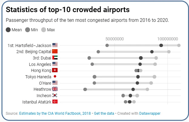
The dataset we chose is “Crowded Airports”, in which it depicted countries across continents and the airports’ passenger density statistics within countries from 2016 to 2020. Based on the dataset, we made bar plots, dot plots, and density plot from both the temporal and spatial perspective to embody the density of airports within countries, between countries, and among continents.
Evaluation Process:

Starting the evaluation process, we decide to first establish the evaluation criteria to facilitate an effective reviewing process. First, we found participants who might have more needs and interests of learning data related to airports density to help us find the criteria more readily. We conducted a survey with only one question: if there is an airport data set given to you, what might be the most important grand factor for you as a passenger to receive the information? Participant A, as an international student who needs to travel often, said since passengers are very diversified, the most significant factor is trying to make sure people from various backgrounds can understand the information equally well and readily. Participant B, who has myopia correction, expressed similar ideas.
Inspired by these ideas, we established our evaluation goal: accessibility would be our criteria. Starting from this track, we decide to evaluate based on the two features we selected from the universal design: 1) equitable use, and 2) simple and intuitive. We employed a cognitive walkthrough task by asking participants who have certain visual impairments (need myopia correction) to help us pinpoint the potential problems and solutions. To be specific, when one of the participants (participant A) being showed our original data website, her task was to find data in dot plots and find the country she was interested in (China). During the process, when she loses her myopia correction, she took around 3 minutes to find the correct plot and she found it difficult to find the country name (although the dot which represent China is relatively large compared to other countries). From these series of surveys, we found our data visualizations had a lot of problems related to accessibility: for our dataset, only people who have normal vision can find specific statistics readily.
But what about people who have visual impairment? What about people who need auditory and kinesthetic feedback to learn information? What about people who prefer ways other than visual learning when receiving new information?

We determined our goal after our evaluation process: We would like to provide equitable access to users; for people for either prefer visual, auditory, or kinesthetic way of reading data, they can readily get access from our prototypes.
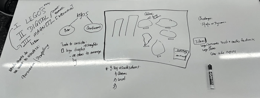
Ideate
The goal is to translate visual information into a format that can be understood through other senses, e.g., touch and hearing. We considered how to use magnets to allow users to feel the pull or push of data points, potentially representing the flow of foot traffic in an airport, and how interactive elements like Lego blocks could be rearranged to represent changing data. We created various prototypes using low-fidelity materials. In detail, we discuss the following possible methods:
- 3D Printing: We can use 3D printing technology to create scale models of data points. For the most congested airport data, you might print a 3D model of the airport layout with different textures to represent areas of varying congestion. Raised areas can indicate more crowded parts, and smoother areas can indicate less crowded ones.

2. Braille Introductions: Braille can be used to provide descriptions and explanations of the data. We could include Braille labels on the 3D printed model that describe different sections of the airport or the degree of congestion.
3. Tactile Graphics: These are images that use raised surfaces so that a person who is blind can feel them. We could create a tactile graph where the x-axis represents time of day, and the y-axis represents the level of congestion. Raised lines or dots of different heights can show the ebb and flow of airport traffic.
4. Interactive Elements: Incorporate interactive elements such as buttons that can be pressed to activate audio descriptions or sound patterns that correlate with data points for deaf-mute users who have residual hearing or use hearing aids. The audio feedback includes spoken word descriptions of the data for individuals who are blind but not deaf.
5. Contrast and Texture: Use high contrast and varied textures in the tactile elements to denote different data points or categories, which can be felt distinctly by individuals with partial sight or blindness.
Define
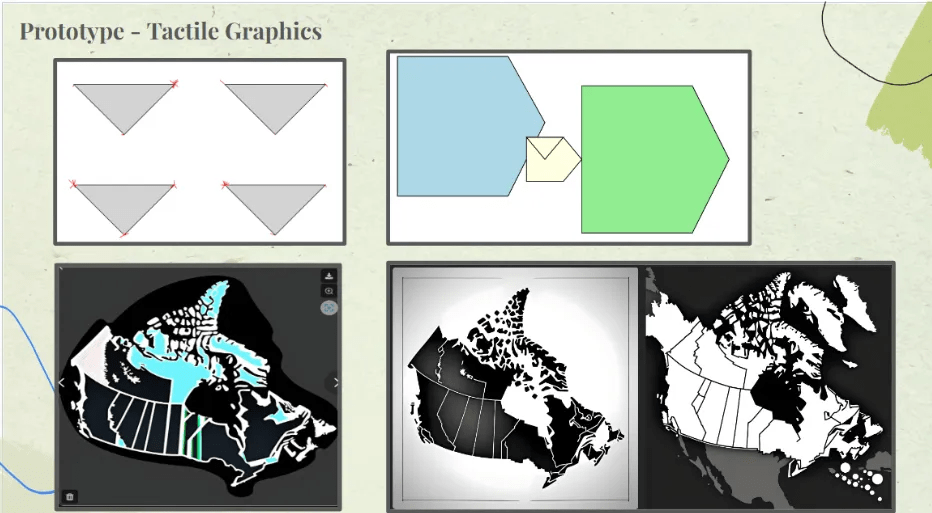
Prototype 1: Tactile Graphics
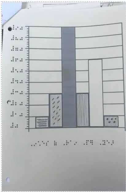
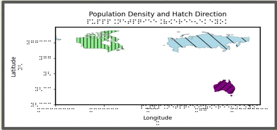
Our aim with tactile graphics was to devise simple and reproducible methods for making data accessible. Drawing from our research into accessible data for persons with blindness or visual impairments, we developed a prototype to visually representing variations in population density among the top four countries with the busiest airports. Our approach involved creating a “plate” roughly the size of four A4 pages arranged in a grid format.
Within each grid (or page), we planned to include a scalable vector graphic (SVG) outlining one of the selected countries. SVGs were chosen because they allow precise representation of country borders, essential for our purposes. We intended to fill the interiors of these SVGs with diagonal line patterns, the spacing of which would denote differences in population density.
Below each SVG, we planned to include a Braille label indicating the corresponding country. This would facilitate identification by touch, as users could trace the outlines of the countries. Additionally, at the bottom right corner of the plate, we envisioned a Braille key associating line spacing with population density on a scale.
To ensure accessibility, all labels and key information would be provided in Braille. This would enable users to extract information about the visualization effortlessly.
However, during implementation, we encountered challenges. Firstly, we were restricted to only three embossed pages, necessitating a simplification of our design. Secondly, generating the charts and SVGs using Python presented difficulties. Despite attempting various methods, including the Python Turtle package and AI-generated SVGs, we faced obstacles.
Eventually, we found a breakthrough using ChatGPT. In general, we responded to these challenges we streamlined our visualization by consolidating our data into a single chart representing multiple countries. The final prototypes is depicted below.
Watch our demo video for this data representation: https://youtu.be/pq6pYAOM5mQ.
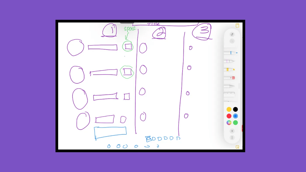
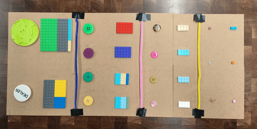
Prototype 2: Data Physicalizing 3D
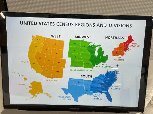
In this specific prototype, our goal is providing a 3-dimensional presentation of density of airports in the United States by displaying visual, auditory, and kinesthetic presentation to the potential users. First, we decided to show the density map of airports in the United States; this is because users may experience increasing difficulty in having equitable access to more specific statistics since they usually be represented in a more trivial and visual way. Supported by the idea of providing visual, auditory, and kinesthetic access to users, we have designed three related features to facilitate the users’ experience. From the visual perspective, we decided to separate the map into four regions: West, Midwest, South, and Northeast. In this way, we have a clearer and sectional presentation, so that users who are visually intact can access this plot more readily. The above low-fidelity prototype mainly targets the visual perspective: in this prototype, we sectioned the Unites States, and tried to section the states to give a more comprehensive view for the users. In addition, we employ Lego bricks with different colors and stack them with different heights to strengthen the visual experiences; the higher the Lego bricks, such as the states of WA and TX, have higher heights.
From the perspective of auditory, we employ the Little Bits to help us create the device that enables the users to capture information in an effective manner. We created two sets of auditory devices for people who have visual impairments to press the button and receive the auditory feedback of the states with the highest airport density of passengers.
From the perspective of kinesthetics, we decided to enable the users to use their hands or other body parts to feel the data. Therefore, we chose Lego bricks to create since stacking Lego bricks together can create various textures, just like braille, so people who have visual impairments can feel the heights and textures more readily to feel the airport density of specific regions.

Watch our demo video for this data representation: https://youtu.be/aOLDtjsvDmQ
Prototype 3: 3D Tactile from 3D Bubble Chart

In the prototype 3, we decided to employ buttons and Lego bricks to provide both visual and kinesthetic visualizations. To be specific, we translated the bubble chart which represents the density of airports in each country by various sizes from a pure visual presentation to a multimodal presentation that can both visual and touchable information. In this prototype, we employ different sizes of buttons to represent the airport density of a specific country, and coordinately, we set up a comparable size of Lego bricks beside the buttons for people who have visual impairments to touch and feel and compare the density of the airports.
The limitation for this prototype would be lack of exact values for the density; initially we decided to incorporate Braille labels beside the buttons to represent the values, however, we encountered problems during the 3D printing process, and were unable to print the Braille labels in this case.
Therefore, one future refinement direction would be incorporating more direct statistics in this prototype for people from diverse backgrounds and different abilities to have a greater understanding toward the density of airports.
Feedback collection
We initially used the height of the LEGO bricks to represent the different densities.

We then asked five experiencers to make judgments by touching the Lego version in a scene with limited vision and hearing. We then collected their experiences and suggestions. It is believed that using height differences to represent differences in passenger flow at different airports is intuitive and effective. However, height alone cannot give perfect information. Therefore, we optimized our design prototype based on the following suggestions collected.
1. Braille Labels: Ensure that all state abbreviations on the map have corresponding Braille labels next to them. Braille should be clear and positioned consistently so that a user can easily find and read it while exploring the map.
2. Texture Variation: In addition to height differences, incorporate distinct textures for each region or state to provide more nuanced tactile feedback. This could be through using different types of bricks or adding unique elements on top of the Legos to signify different densities or other relevant data points.
3. Consistent Orientation: Make sure that the map is oriented in a standard north-up position, as is customary with maps, and include a tactile compass rose for reference. This will help orient users and give them a point of reference when they are trying to locate specific states or regions.
4. Edge Definition: Clearly define the borders of each state and region with raised lines or a different texture that can be easily felt. This will help blind users distinguish between adjacent states and understand the overall shape of the country and its regions.
5. Auditory Feedback: Integrate audio feedback that can be activated by touch. For instance, when a user touches a state, a voice can announce the state’s name and provide data about the airport density.
6. Scale and Legend: Include a tactile legend that explains the scaling used for the height of the Legos, so users can understand what the different heights represent in terms of airport density. Also, using a linear or non-linear scale that is easy to understand through touch alone.
7. Accessible Guide: Provide an accessible, audio-based or Braille guide that explains the layout of the map, including the color coding and height system. This guide should provide context for the data being presented and any conventions used in the map’s design.
8. Overall Map Size: Consider the overall size of the map. It should be large enough so that the states are not too close together, making it difficult to distinguish them by touch, but not so large that it becomes cumbersome to navigate.
Although we were not able to solve all the problems due to available materials and some technical difficulties, this design process brought our final design prototype closer to our goals.
Link to website: world (hcineeding.webflow.io)

留下评论