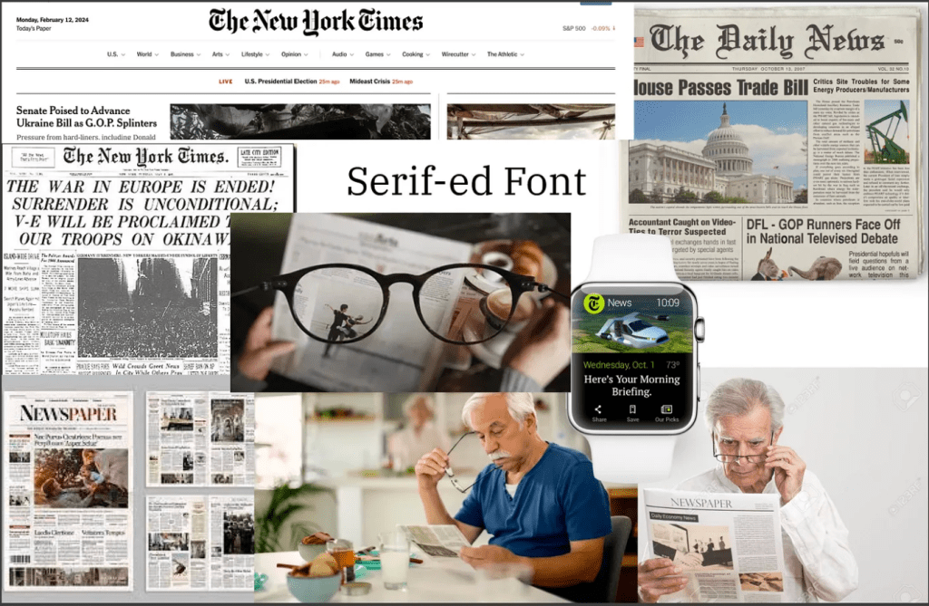
In recent decades, the bursting development of technology and the tendency toward digital documentation have affected people’s habits of receiving news and new information. Compared with buying a paper newspaper, more people tend to employ digital devices to read news. Fast, effortless, and free — why not read the digital ones?
But what about elderly people?
For elderly people, visual impairment is present in over 25% of adults in the US aged 71 years and older. In addition, buying paper-version newspapers has become even more difficult due to the prevalence of digital documentation, while a lot of websites make it difficult for elderly people to manipulate and extract the information they need.
Therefore, a renovation of website design for elderly people to read digital newspaper is needed.
In our design, we target the website of the Atlanta Journal-Constitution since this is one of the biggest news journals in the area of Atlanta, and our intended audience is elderly people who have the habit of reading news. Our goal is to redesign the homepage and the health news page (elderly people tend to pay more attention to the health section of newspapers); we aim to design three types of screens: laptops, smart watches, and large display screens, in order to support elderly people’s reading experiences on assorted types of screens.

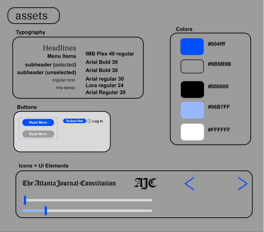
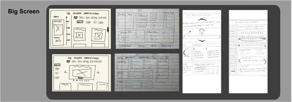
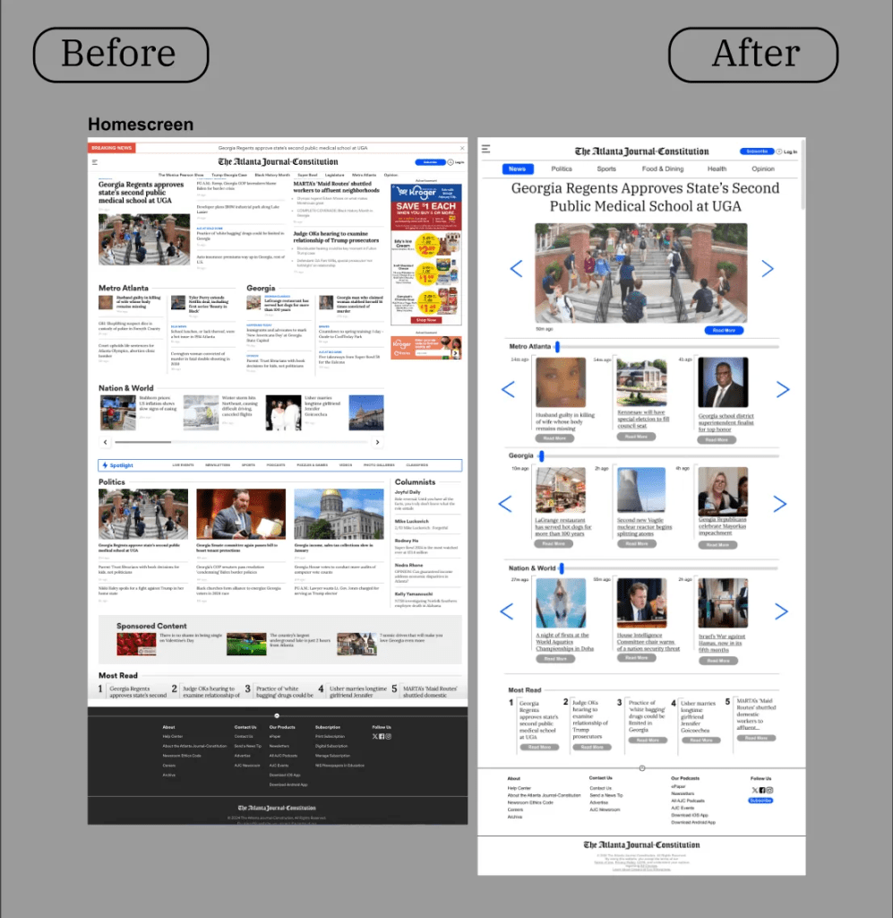
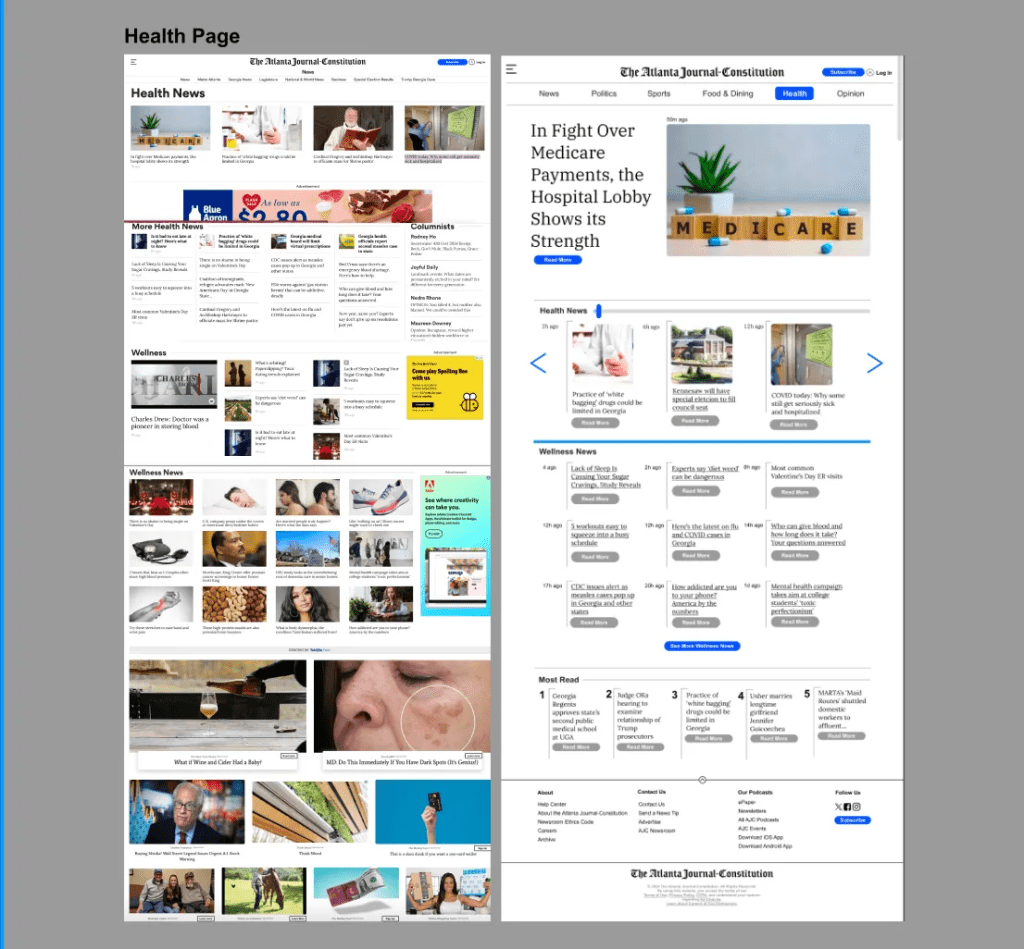
First, we started to sketch different versions of the homepage and health news pages in various screen sizes to collect our thoughts on this design. Among our sketches, we emphasized three important aspects: first, the design of the website should be concise and have bigger fonts. From our perspective, the original design of the website contains too many advertisements; some of them even occupy a large corner of the whole screen. This would potentially affect the reading experiences of elderly people since they could not read information effectively. Second, we believe the navigation of the website should be more direct and obvious. In our sketches, we build a lot of arrows to lead the elderly people to specific sections they need to find. Third, we found that it is important to include a larger floating menu bar in order for people to manipulate the screen more readily. The thing we did not decide and need more revision is the specific organization of different sections; we think in our finalized prototype, we might need to focus on the design of specific sections in order to fit with elderly people’s reading needs and interests.


In our finalized prototype, we decided to integrate and advance our drafts and address the issue of selecting specific contents to assorted sections.
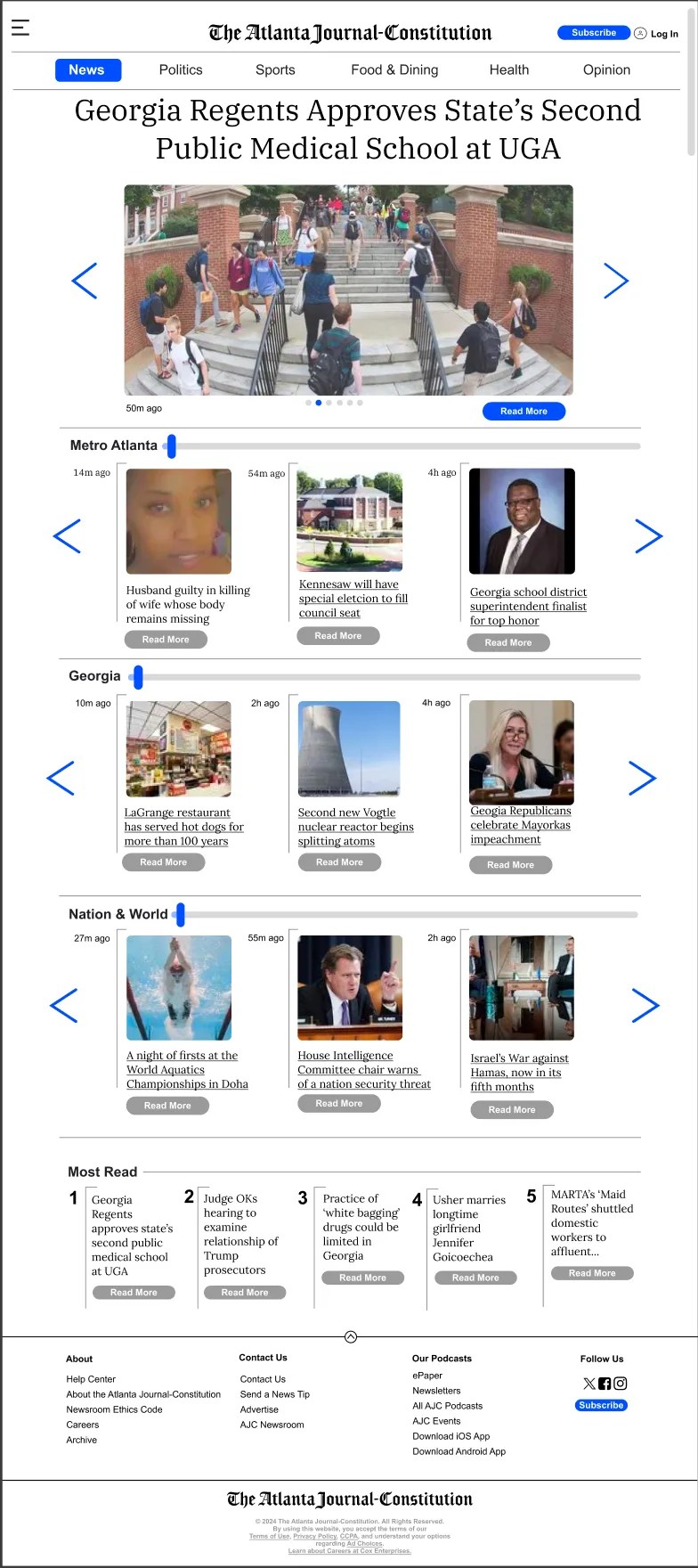
In our prototype, for the laptop screen size, we first set large floating menu bars; this is advantageous for people to direct themselves to specific topics they are interested in instead of worrying about finding contents. Next, we put the most popular news in an enlarged view in order to make a catching impression on the readers. In the meantime, readers can readily enjoy the most popular and prevalent news. On the left and right sides, we put two large arrows to direct people to click to view other news. This arrow bar is very straightforward, so elderly people can directly click on it instead of worrying about how to navigate to the next piece of news. Thirdly, we segment different sections of topics according to the geographical scope, from metro Atlanta to the nation-wide and eventually to the world; this would present different reading order for elderly people apart from the topics of contents. In addition, we decide on employing a slide bar for elderly people to navigate horizontally among the news in a more smoothly and concise way.

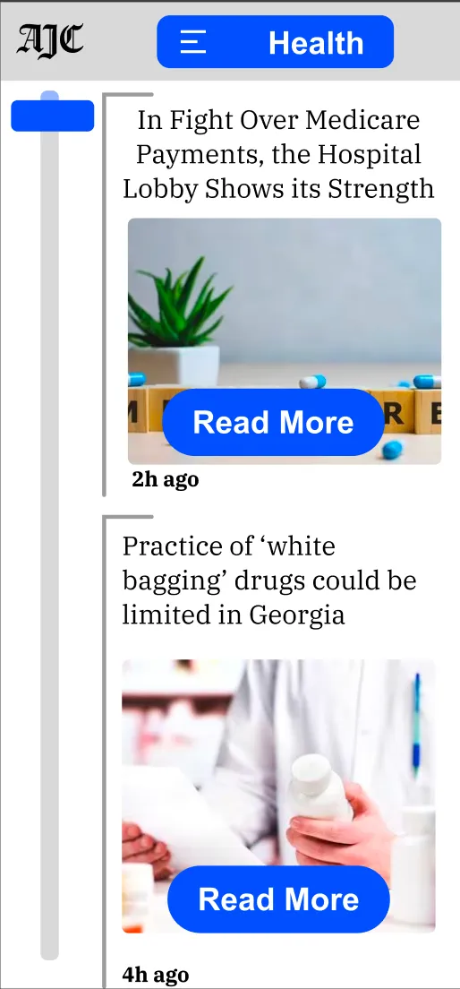
For the smart watch prototype, since the size of the screen is relatively small, our design idea is based on navigation approaches and the presentation of the most important information. Based on these two standards, we designed a calendar-like screen. To be specific, on the left side of the screen, we create a vertical slide bar for elderly people to maneuver. Then, we set a central pane that dynamically updates with the most pertinent information, such as news headlines or important reminders, which are displayed in large, clear font for easy reading. On the right side of the screen, there’s a ‘Read More’ button for each item, designed to be easily selectable, even for users with limited dexterity. This allows for the expansion of the details into a larger, more readable format should the user choose to delve deeper into the content, emphasizing accessibility and simplicity.

Finally, for the design of the prototype of the large display screen, we decided to stick with the idea of bringing concise, effective information delivery approaches. Therefore, we would start the website with compelling and catching headlines and pictures from the most prevalent news in order to present an attractive presentation for elderly people to read the contents they may be interested in. Then we employ large vertical sections to present information according to the geographical sections, just as the laptop version did; we aim to provide a more thorough but concise version of visual presentation here since the available space is larger. On the other hand, we think the design for the large screen needs more minor revisions compared to other screen sizes since we might need to delve into the design process to seek out ways to maximize the advantage of the large screen.

In conclusion, through our design process, we aim to provide elderly people with a more convenient and comfortable way of accessing information from newspapers. We adapt different screen sizes to try to provide more comprehensive help for people. Compared to the original website design, our design focuses more on: 1) manipulating and navigating through the websites more readily; 2) being more effective and efficient in reading interested materials; and 3) being able to access information on various screens readily. The thing we need to pay more attention to revising in the future is to see how we can use the large size of the display screen more thoroughly and innovatively and how we can apply the design to a wider targeted audience.
Thank you for reading our design! you can find more detail on Figma website of our design.

留下评论