“Let the dataset change your mindset.” — — Hans Rosling
Taking flights has been one of the most popular transportation modes due to its efficiency and increased accessibility. Through time, as the world becomes more interconnected, people will have an increasing willingness to employ air travel as their means of transportation (Bureau of Transportation Statistics, 2003). Therefore, airports in recent decades have become increasingly developed and crowded. Aspiring to have a more profound understanding of air travel since such modes of transportation become more popular, our group decided to focus on a dataset related to airports and build visualizations on it, allowing the audience to have a more comprehensive and profound perspective on flights.

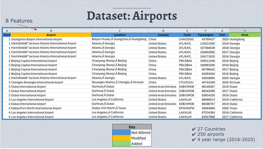
Why “Most Crowded Airports”?
In our project of visualization, we decided to employ the dataset of “Most Crowded Airports” discovered on Kaggle, a professional website for users to find specific datasets in various topics. In this dataset, we can take an overview of the most crowded airports between 2016 and 2020, involving data related to 27 countries with a world-wide span, states and regions, cities, 250 airports, passenger numbers, and a 4-year range. There are two reasons to choose this specific dataset. First, although the number of countries is not tremendous, the span of the country is international compared to a lot of datasets that focus on specific continents; therefore, such a grand geographical span would allow us to present a more comprehensive visualization for a large potential audience. Second, this content in this data would allow us to explore assorted questions from different perspectives, such as “Which country has the most crowded airports?” and “Which year had the most passengers?” thus presenting more information on air-related topics to the audience.
Design Process
To present resonable and persuasive visualizations generated from this dataset, we first employ the five-design-sheet (FdS) approach to sketch design for visualizations. First, we meet and brainstorm, generating and filtering ideas; we found it would be compelling if we presented the data from spatial and temporal perspectives. To be specific, we decide to enable the audience to approach the data more readily by exploring the spatial distribution of the number of flights and passengers and also be able to see the potential trends of air data through time more readily.
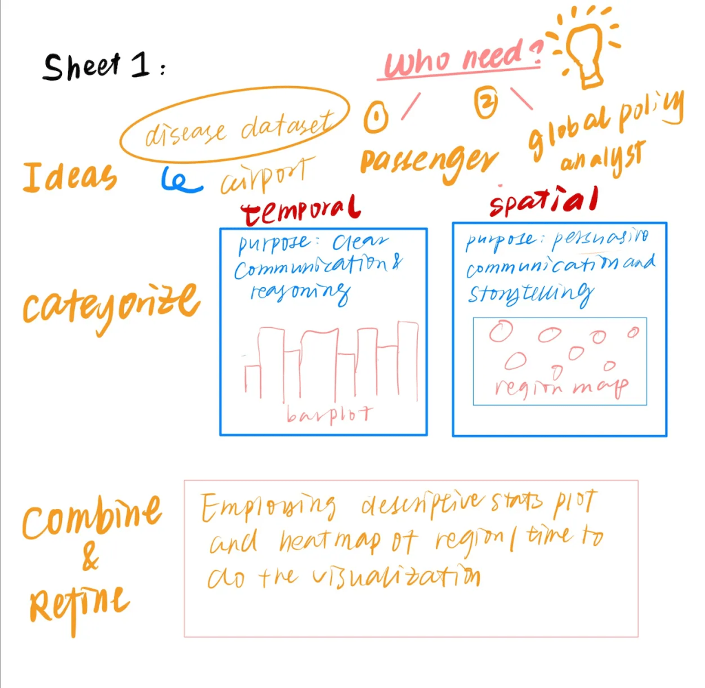
Then, in the following 2–4 stages, we recorded three ideas from the intial brain-stroming phases. In this process, we intend to achieve two purposes: communication and persuasion, through the process of creating spatial and temporal visualizations. For instance, initially, we found we might employ map charts to reason the data from a geographic perspective. Employing map charts would enable the audience to see specific clusters and geographical trends from a holistic perspective, thus increasing their understanding of airport data.
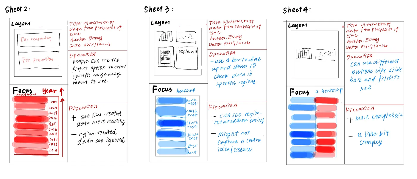
Finally, in the stage of realization design, combining the purpose of communication and persuasion and the visualization tools we contemplated above, we generated a more detailed design as a guideline to build the actual visualization on the website.
Building visualizations and the website
(The above web link would be best viewed in FireFox)
In order to provide a clear reasoning and a compelling persuation, we first start from the step of data cleaning. One of our first task was to extract some features out of the dataset, namely the State/Province that each airport was in. This was done using a bit of string manipulation on the ‘Location’ field. The second thing we had to do was edit all the Airport names. Initially, all airport names had the country names prepended to airport names which was redundant — since we already have a separate field ‘Country’ — and made the already long airport names, even longer. Thus, we removed the prepended country names from the airport names for each airport.
After cleaning the data, we determined the tools for building the website and visualizations. First, for the website, we chose to employ Webflow to build it. The reason we chose Webflow is due to its flexibility; this platform allows us to embed interactive visualizations with complex filters readily, allowing us to present the audience with a flexible environment to view the data. Second, for the visualization part, we employed Tableau to build them. This is because Tableau allows us to conduct in-depth data exploration by readily employing various charts and graphs to present the data in order to choose the most compelling ones, and Tableau enables us to embed filter settings for allowing the audience to select a specific range of data they would like to see in a visualization graph.
Next, guided by our design guidelines of clear reasoning and compelling persuasion, we decide to employ spatial and temporal visualizations to serve these two functions.
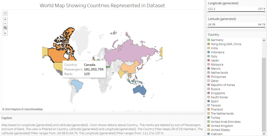
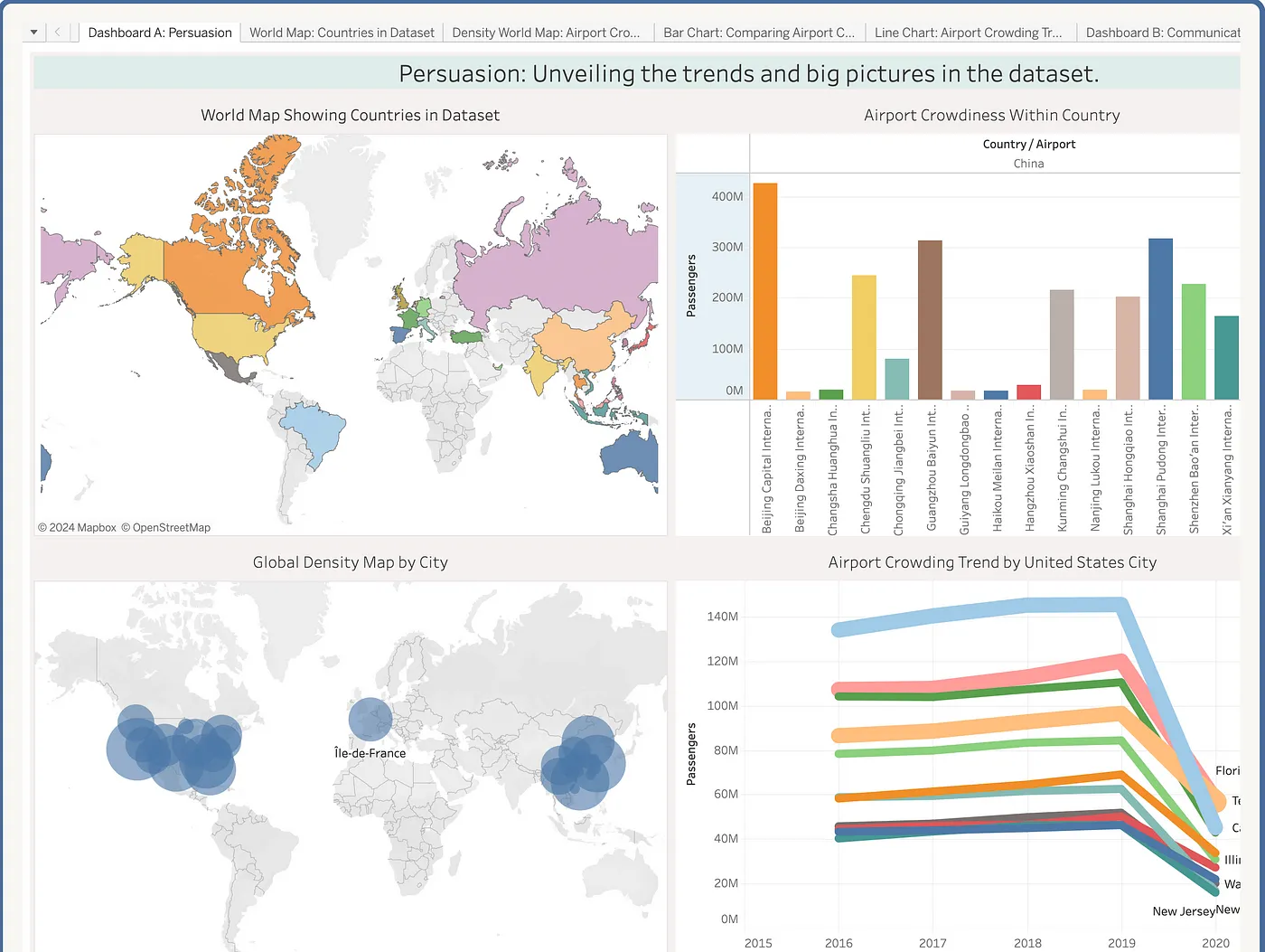
First, we decide to create a map chart for displaying audience a geographical range of our dataset with interactive filter settings which allow users to choose random longitud and latitude to see specific regions/continents. During the process of generating this map chart, we encountered our first challenge.
It is about color. Out of our expected potential challenges, such as coding issus, the first challenge we meet is that we cannot decide the color pattern used for this visualization. To be specific, we debated over whether we should choose to use the same color but different shades or use a variety of colors to express this chart. Choosing the same color but different shades would allow us to add more information to this chart; that is, a region with a darker color would represent more passengers in this region. However, the disadvantage of this design is that since a lot of countries would show a relatively small region on the world map, it would not present very effective information for the audience about the number of passengers in a specific country. Compared to choosing the same color, we could also choose to paint different colors for different countries and add a brief information box with the country name, number of passengers, and other information when the users put their cursor on this region. The advantage compared to the former design is that it would allow the user to differentiate the borders of countries more clearly, thus allowing them to find interested regions more readily to check the passenger statistics. Therefore, we decided to employ a variety of color palettes for this map chart in order to create a more flexible environment for users to see the data.
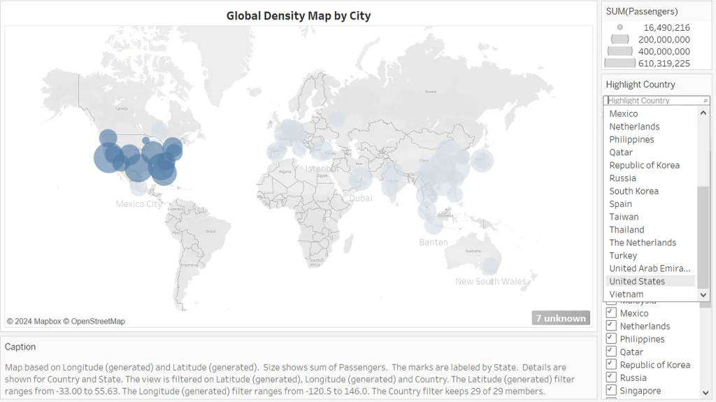
Second, we were inspired by the former map chart and decided to provide a specific map chart for presenting the density of passengers around the world, showing the users the geographical clusters of flights and passengers. In this map, the filter bars on the right side allow the users to select specific countries or regions to check the clustered region, thus obtaining a direct observation of the density region with a large number of passengers across the world.
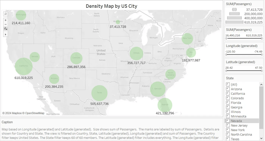
Third, in our visualization, we aim to provide not only a grand picture but also detailed and specific spatial visualizations. Therefore, we create a density map by US City, in which the user would be able to compare the density of passengers between the northwestern and southern US by changing the longitude and latitude slide bars, filtering the data according to the level of crowdedness by choosing a specific range in the SUM slide bar, etc.
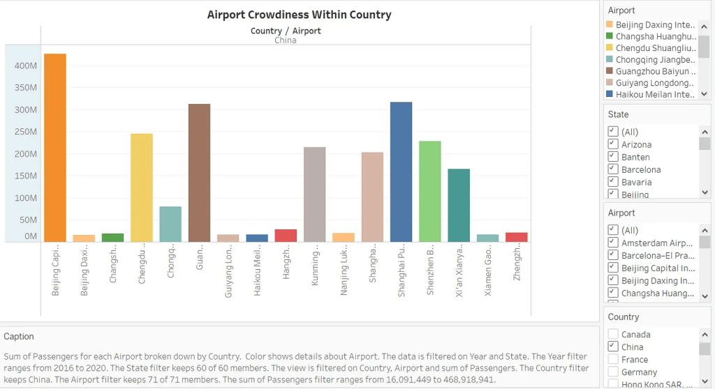
Fourth, to present more detailed spatial visualization, we narrow down from the level of cities to the level of airports. In this bar graph, we present the crowdedness of airports within a specific country. For instance, the users can choose a specific country, like China, from the filter settings and airports they would like to know to compare and contrast the crowdedness.
With the spatial visualizations, the users could have a top-down understanding of the dataset of crowded airports. Apart from understanding the crowdedness of airports within a world-wide range, within a specific country and cities, and among specific airports, the user would be able to effectively know the grand and detailed pattern of flights, thus allowing them to make more appropriate choices when they plan their own flights. Further, more researchers in economics and politics might also need this visualization to understand the global connectivity and regional transportation conditions more clearly.
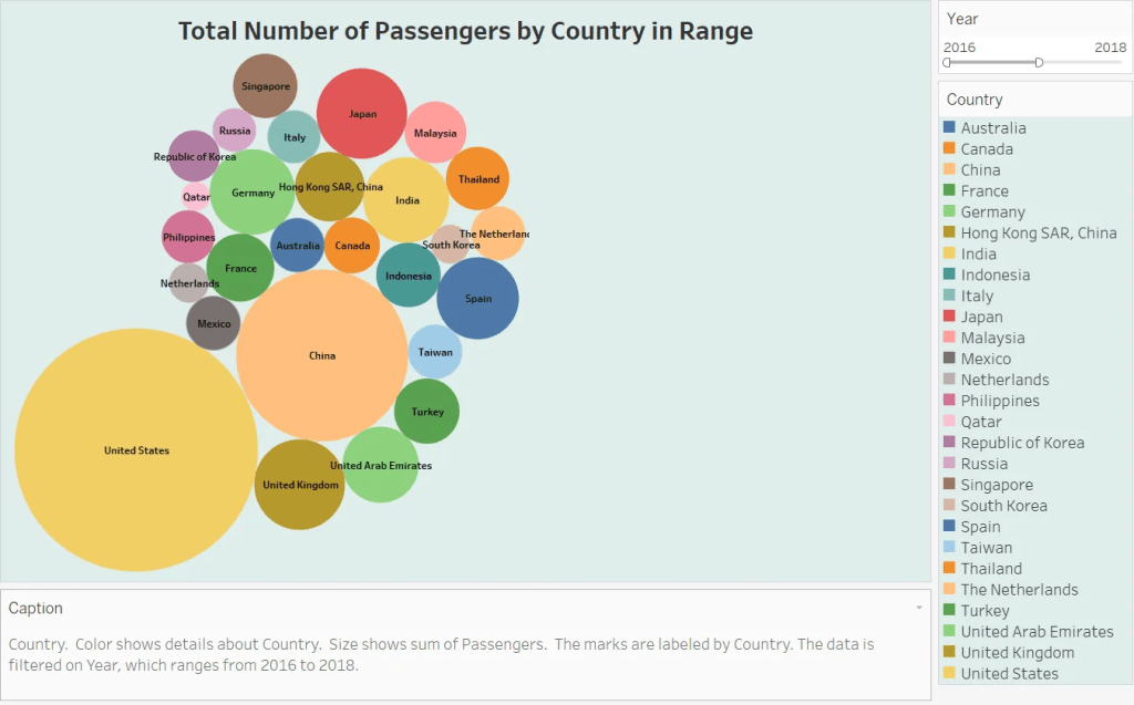
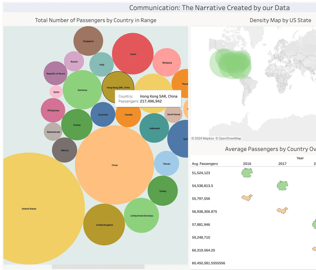
Then, we decide to build temporal visualizations to present specific aspects of this dateset. First, we build a bubble chart, a chart that displays multiple circles in a two-dimensional plot, to show the total number of passengers by country. In this chart, through interacting with the filter to choose a specific year and country, the users would be able to compare and contrast the change in passenger numbers among countries through time, thus knowing the development of passenger numbers in a comparative way.
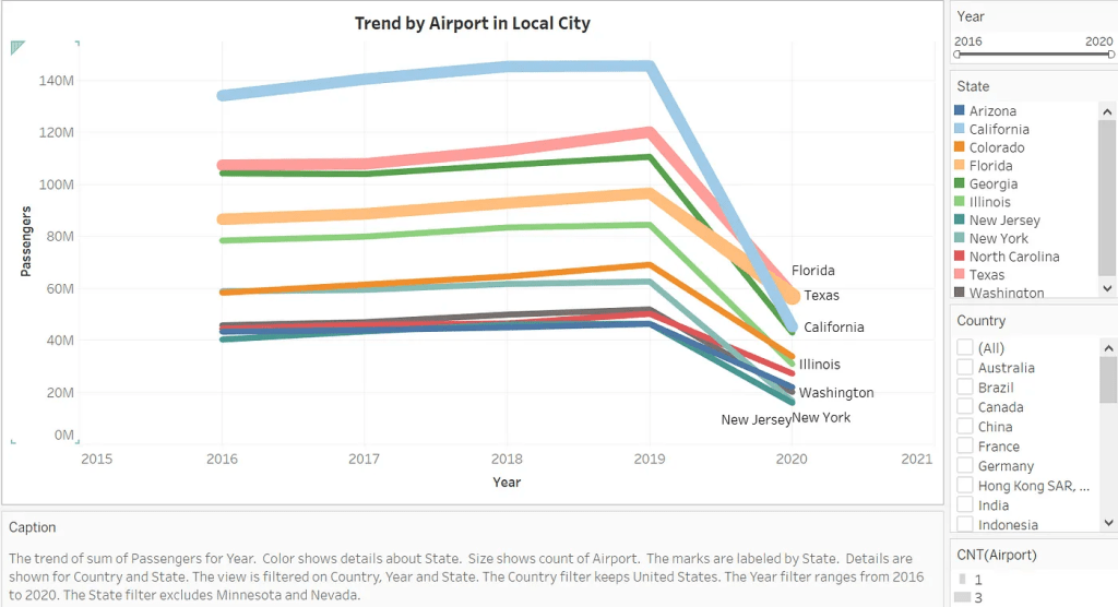
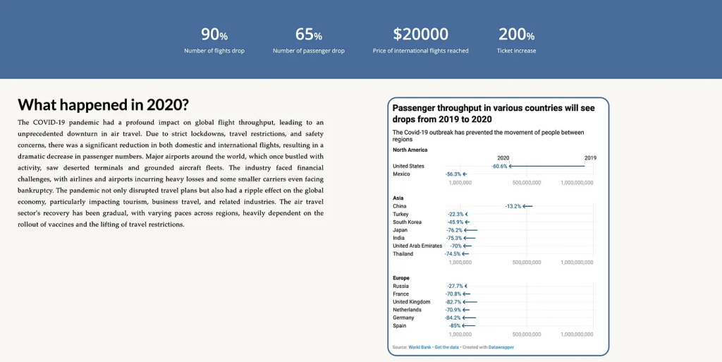
In addition, we employ a line chart to present the trend of the number of passengers in specific cities, allowing users to compare both short-term and long-term changes. This chart enables us to provide more profound insights to a potential audience, conveying a persuasive perspective. To be specific, this chart compares the trend among several states in the United States. We can clearly perceive from the chart that from 2016–2019, the lines are in a slight increasing manner, meaning the passengers in these states are increasing. However, from the period of 2019 to 2020, there has been a steep decrease in all states; the state with the deepest decrease here is California. This chart might imply a story beyond air data; this chart could become one of the potential evidences of COVID-19’s impact on people’s lives. Since the pervasiveness of COVID-19, many activities are restricted, including flights. Therefore, the decrease proves COVID’s negative effect on the number of passengers, especially in California, which has a lot of international and domestic flights.
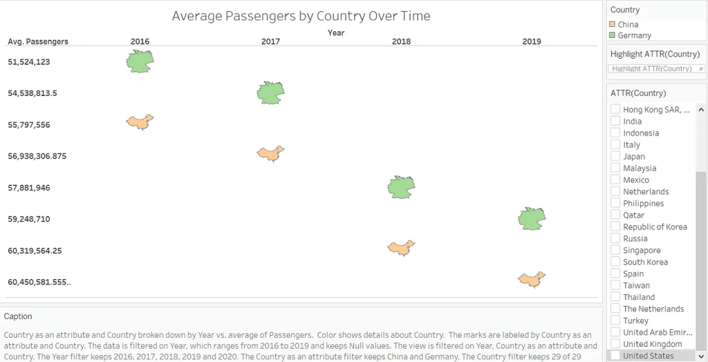
Third, we made a visualization to present average passengers over time among countries for users to compare and contrast. For instance, in this chart, the user chose to compare China and Germany’s average passengers from 2016–2019, showing that China tends to have more passengers through time on average.
Generating visualizations to present temporal data would allow the users to compare the number of passengers through time more readily, thus having more opportunities to gain insights beyond the flight data but on potential temporal factors such as COVID-19.
In the end, we integrate our visualizations into two dashboards to achieve our two purposes: 1) clear communication and reasoning, and 2) persuasive communication and storytelling. In the first dashboard, we achieve the purpose of persuasion by introducing the spatial distribution of this dataset, global density, and regional airport density for users to plan their own flights more readily, and we allow passengers to read the data in a more in-depth way, enabling them to connect airport data with more topics such as pendamics in the current interlocking world. In the second dashboard, we achieve the purpose of communication by allowing the users to take assorted perspectives during the reasoning process, thus having more comprehensive insights into the passengers in a world-wide range and at different timestamps.
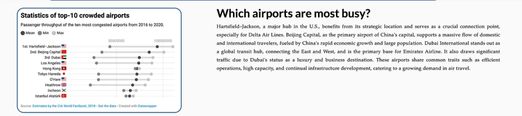
On our website, apart from the above interactive visualization, we also include several other aspects of data in order to provide a more comprehensive perspective for the audience. For instance, we include the section “Which airports are most busy?” to provide users with more practical data when they decide where to start their flights.
In addition, we provide a section on “What happened in 2020?” correlating to our prior line chart visualization, illustrating the impact of COVID-19 on airports.
Conclusion
Here is the demo video link
In conclusion, the visualization of crowded airports aims to provide the audience with a more reasonable and in-depth understanding of airports in a global context. Through the development of technology and increasing willingness to take flights as transportation, it is necessary for a larger audience to know more about flight-related data so they can better plan their journey and understand the potential factors that would have an impact on their flights.

留下评论